Stick Figures In Danger!
Visualizing “Qualitative” Risk Assessment
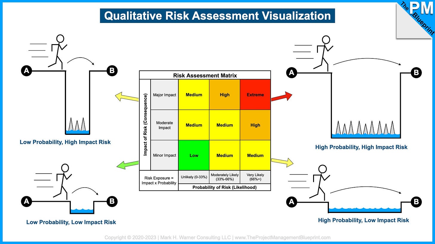
A common way to display project risk exposure, or severity, is via a risk exposure matrix. This is sometimes called a risk assessment matrix or grid, and it’s the standard PM method of qualitatively showing a risk’s probability and impact. Unfortunately, many new project managers struggle with the orthogonal/independent relationship of the two grid axes.
To help visualize the relationship between the probability (i.e., likelihood of a risk occurring) and the impact (i.e., the consequence if the risk occurs), here’s a simple graphic to illustrate how Risk Exposure = Probability x Impact. The little stick figure represents your project as it moves from Point A to Point B in the plan. The ditch represents a threat (risk) to your ability to get from A to B.
Risk management is all about identifying these threats ahead of time, analyzing their severity, and then putting in place methods of reducing their probability and/or impact down to a level that you can accept.


