
Project Diary: Sometimes You Gotta BRAG about the Project
Using a "stoplight" report to describe progress, status, and potential issues

“It’s not bragging if you can back it up.” —Muhammad Ali
TL;DR
What: A stoplight or “BRAG” status table is a one-page, color-coded view of recent project progress, current status, and upcoming work, organized around key deliverables, activities, and milestones.
Why: It gives stakeholders an at-a-glance executive summary, forces the PM to regularly step back from the weeds, and is often a formal requirement from sponsors and oversight bodies.
How: Define the format and time resolution, agree on clear color definitions, and regularly update a standard table that can be reused in reports and briefings, as we’re doing for ngGONG with a BRAG-based Google Sheet.
What is Stoplight / BRAG Reporting:
In traditional project management, “stoplight reporting” means using a simple, color-coded table to summarize status across a handful of major deliverables, activities, and milestones. The classic version is called a RAG chart (Red, Amber, Green), where the colors indicate varying degrees of status. (The slightly more complete version is BRAG (Blue, Red, Amber, Green)). The goal of a stoplight chart is to compress an overview of the project into a single image that a stakeholder can scan in 10–20 seconds and immediately understand how well the work is proceeding.
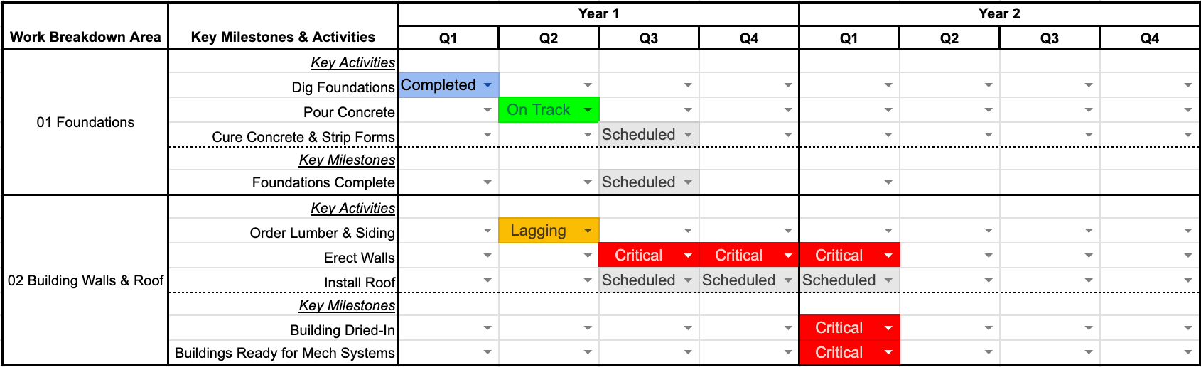
A stoplight report usually looks like a grid: reportable items down the left, time across the top, with each cell filled with a color that reflects status for that item over that period. The items might be high-level WBS elements, major deliverables, primary activities, or Level‑1 milestones that you’ve already defined for external reporting. The time axis can be months, quarters, or years, depending on the scale and phase of the project. The graphic itself is usually included in a larger report, but is also standalone and can be extracted and dropped directly into someone else’s briefing.
For a BRAG report, the color Blue indicates work that is completed and effectively off the table; green means on track; amber (or orange) signals lagging or potential concern; red indicates significant trouble, such as major delays or technical issues. Additionally, many projects also add gray for future work and white for not applicable. In a single glance, you can see when a WBS area moved from gray to green to blue, or when something went amber or red. Done consistently, this becomes a powerful communication tools in your reporting toolkit.
Why Stoplight Reporting Matters:
In many projects, stoplight reporting is not optional. Sponsors and oversight agencies often mandate a simple, visual status summary like this as part of their reporting requirements. Per our project award terms and conditions, the NSF requires a stoplight-style table provided to them on a quarterly reporting cadence. This table reduces the cognitive load for reviewers who are scanning multiple projects and need to understand where attention is required.
Beyond stakeholder compliance, a BRAG table is just good project management practice. It forces you, as the PM, to step out of the day-to-day details and look at the project as a whole. Instead of getting lost in hundreds of schedule activities or Jira tickets, you ask a more fundamental question: “Across our major deliverables and Level‑1 milestones, what’s actually on track, what’s slipping, and where should my attention be focused?” That perspective is hard to maintain without a simple, recurring tool like this.
There is also a portfolio effect. Stoplight reports allow senior leadership to compare multiple projects or subsystems on a common scale. If every project uses the same timeline and set of colors with the same definitions, it becomes much easier to identify systemic issues, spot chronic problem areas, and allocate support. Even at the individual project level, a consistent BRAG chart becomes a historical record. You can see when a particular area was struggling, when interventions were made, and how long it took to recover.
How to Build a BRAG Chart:
The first step is to decide what you are going to show on the axes. On the left-side vertical axis, list the elements that matter most to you and your stakeholders: e.g., high-level WBS areas, major deliverables, and key reportable milestones. These should map cleanly to the story you tell elsewhere in your reports and to the Level‑1 (or equivalent) milestones you’ve already defined. Avoid the temptation to list every detailed activity; instead, pick a few dozen items that truly represent the “forest,” not the individual trees.
On the horizontal axis across the top of the chart, choose a time resolution that matches both the project’s duration and your reporting cadence. For many engineering projects, quarterly time buckets work well for the near term, with annual buckets for long-range planning. If your project is short, then months (or even weeks) might make more sense. The key is to strike a balance: too coarse makes the chart vague and uninformative; too fine and it becomes a sea of tiny colored boxes that nobody can interpret. Whatever you choose, keep it consistent over time so stakeholders can compare one report to the next.
Next, define your colors explicitly, in writing, and share those definitions with your team and stakeholders. For example: Blue = complete; Green = on or ahead of plan; Amber = behind plan but recoverable without major re-baselining; Red = significant issue requiring intervention and/or re-plan; Gray = not yet started (future period); White = not applicable. The definitions can be quantitative (e.g., “>10% slip is red”) or qualitative, but they must be consistent. Once the structure and color key are in place, build the table in a tool that’s easy to update—Excel, Google Sheets, or whatever your organization already uses—and reserve a full size image in your regular report for the “Project BRAG” so that it can be easily reused in other decks.
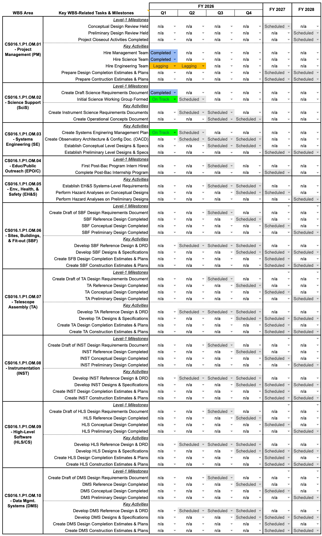
How ngGONG Is Using BRAG Charts:
For ngGONG, the BRAG table lives in a standing Google Sheet that can quickly be updated and then exported as a static graphic for inclusion in our monthly report to the NSF and internal leadership. This keeps the working version live and editable, but ensures that each month’s report captures a snapshot in time that won’t change later. It also makes it easy for others—program management, NSO leadership, or communications teams—to grab the same figure for their own use.
On the left-hand side of the ngGONG BRAG chart, the rows are organized around the ten primary WBS areas, with two to four key elements under each one. Those elements include both primary activities (such as completion of a primary design activity or document), and/or Level‑1 milestones that are reportable to NSF. This structure aligns the BRAG chart directly with the rest of the project’s planning artifacts: the WBS, the integrated schedule, and the milestone list all point to the same set of elements.
Across the top, the ngGONG BRAG chart uses a rolling-wave approach. The current and near-term periods are broken into fiscal-year quarters, where the detail matters and where stakeholders expect to see more granular progress. Farther out, the columns transition to fiscal years instead of quarters, which keeps the chart readable and avoids false precision about work that is still several years away. The color scheme we use is full BRAG, plus gray for planned future work and white for not applicable, so that every cell has a clear and intentional meaning. Over time, the chart will fill in from gray to green to blue, and occasional patches of amber or red help focus attention where it’s needed.
The Bottom Line:
A BRAG-style stoplight report is a simple but powerful way to “brag” about your project’s progress while also being transparent about where things are lagging. It compresses complex schedules and deliverables into a one-page, color-coded story that stakeholders can understand at a glance, and it forces the project team to step back regularly and look at the forest instead of the trees. For ngGONG, this kind of reporting is both a requirement and a best practice, and it fits naturally into a broader, systematic approach like the Project Management Blueprint. Done consistently, your BRAG chart becomes a type of honest “selfie” of the project, one that you can stand behind even when a few pixels are red. Remember, it’s not bragging if you can back it up—with a stoplight chart, that is!